Company
Daxko
Year
2023
Roles
Component Architecture, Visual Design
Simple Component Compositions
A component library redesign focused on improving performance, usability, and maintainability across a $161M product ecosystem. The project supported 10+ designers working across 10 different applications, achieving a 95% reduction in component complexity and 77% improvement in render performance.

+95%
in Efficiency
+77%
in Performance
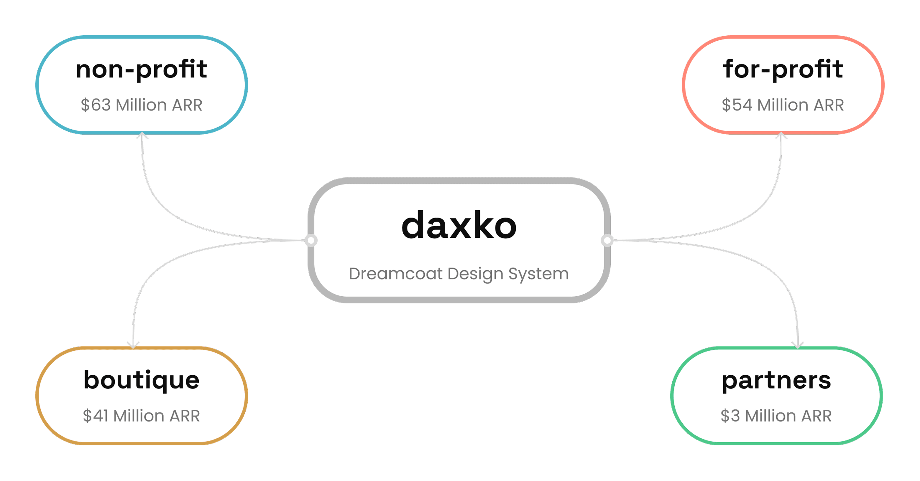
Dreamcoat is a federated, multi-product design system supporting Daxko's B2B platform across four verticals: non-profit, for-profit, boutique, and partner products. The system was architected by a staff designer and maintained through contributions from designers across each product team, serving 10+ designers building 10 distinct applications with 50+ shared components.
The component library was in a trial period, with designers validating the system in Figma before engineering would commit resources to build it in code. As a platform designer and founding member of the design system committee, I operated as both a contributor and a daily user of the library. That dual perspective made the usability issues impossible to ignore, but I didn't want to assume my experience was universal.
Research
Before proposing any changes, I wanted to validate whether the pain points I was seeing were shared across the team. In the spirit of continuous improvement, I designed a 4-point Likert survey with no neutral option, forcing respondents to take a directional stance. Results were normalized so positive scores indicate agreement and negative scores indicate disagreement.
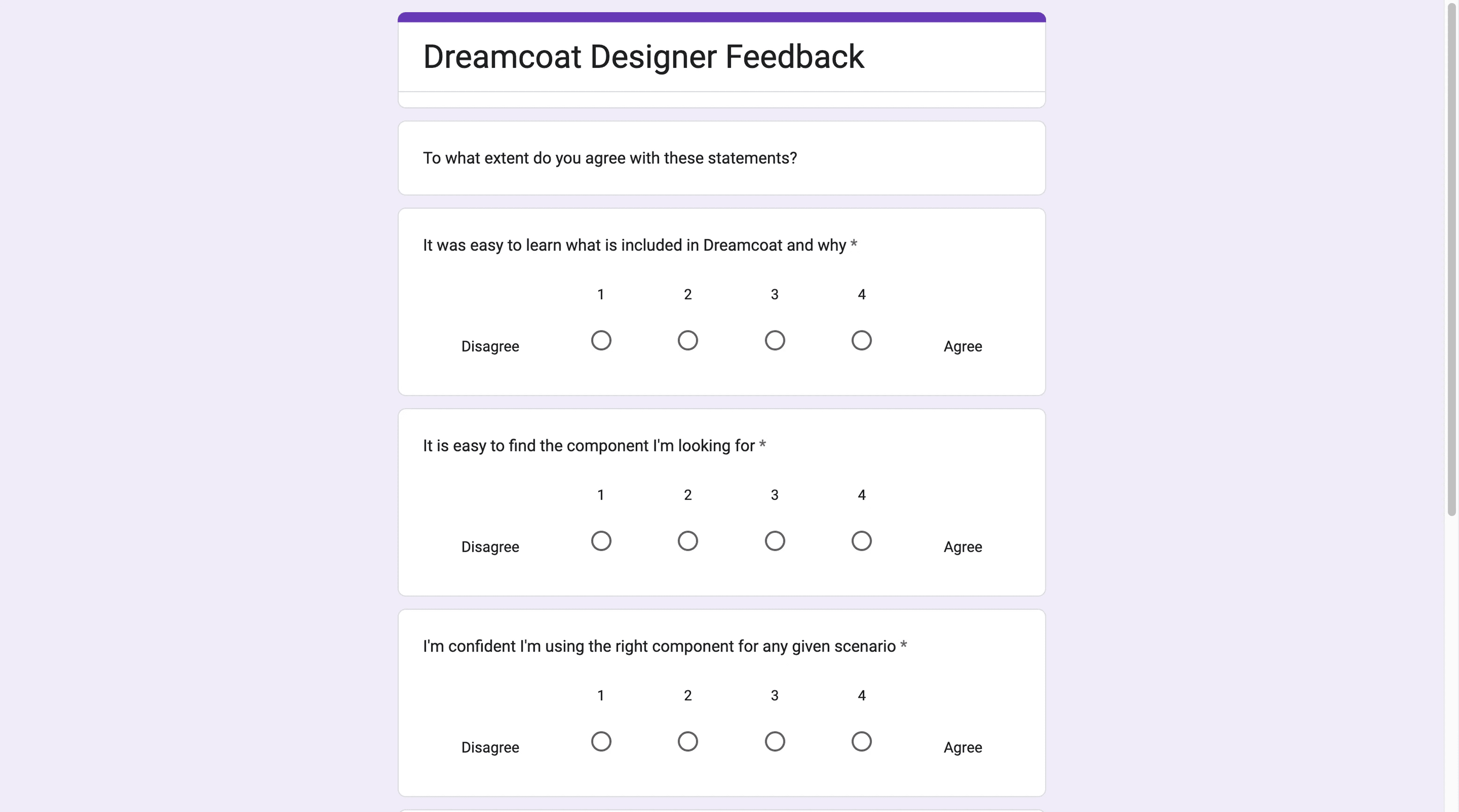
Two scores stood out. Stability at −6 meant frequent breaking changes had eroded trust in the system. Performance at −1 confirmed that Figma file degradation was a shared pain point, not just my own.
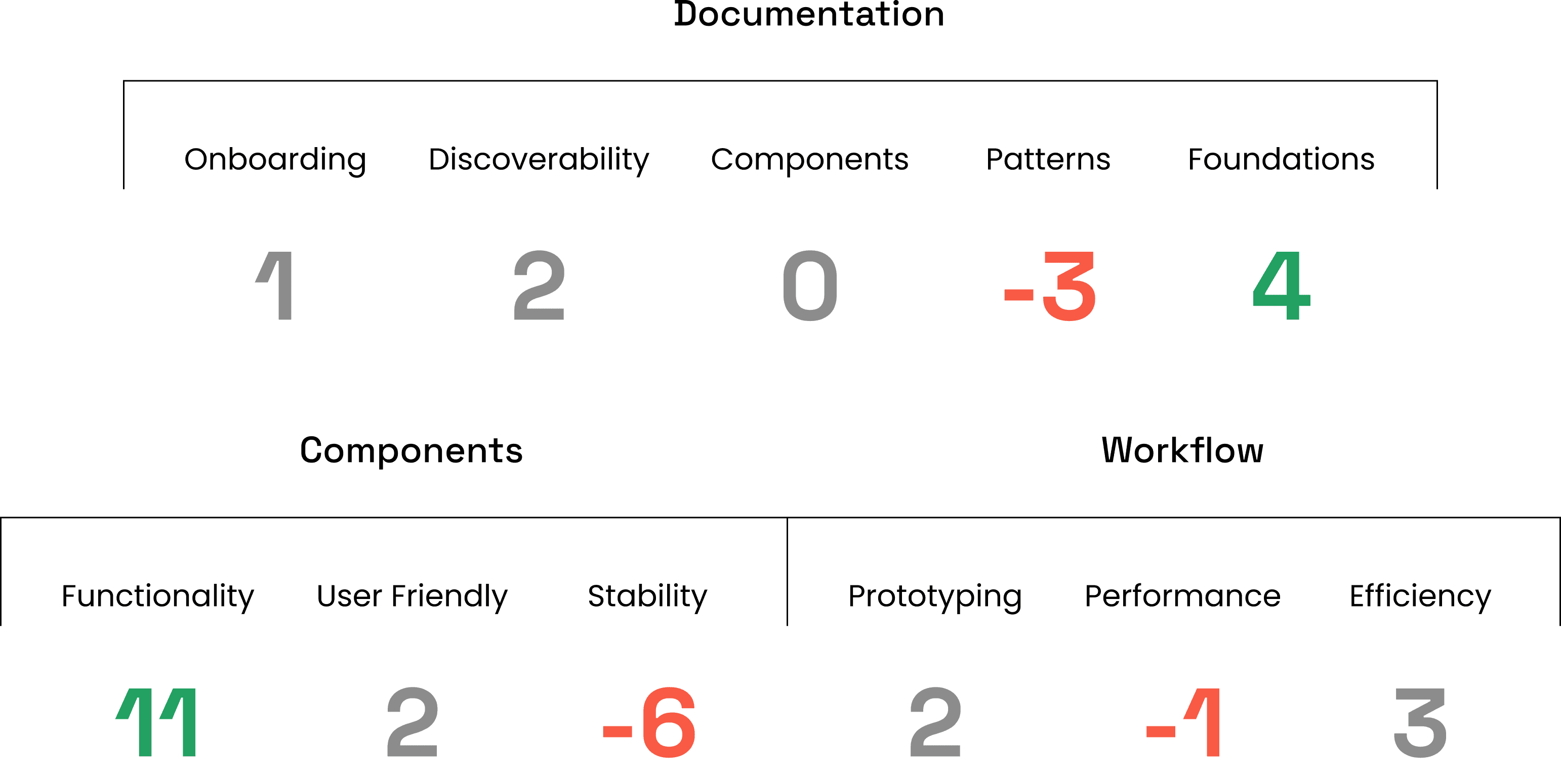
A documentation audit confirmed zero component-level docs, negative scores for pattern guidance, and only foundational token documentation at adequate levels.
The Problem
The system's foundations were strong, but its components were unstable, underperforming in Figma, and undocumented. If these components were going to earn engineering investment, the underlying architecture had to be rethought.
Audit
With the survey data pointing to stability and performance as the core issues, I audited the button component's property architecture to understand why. The problems were structural.
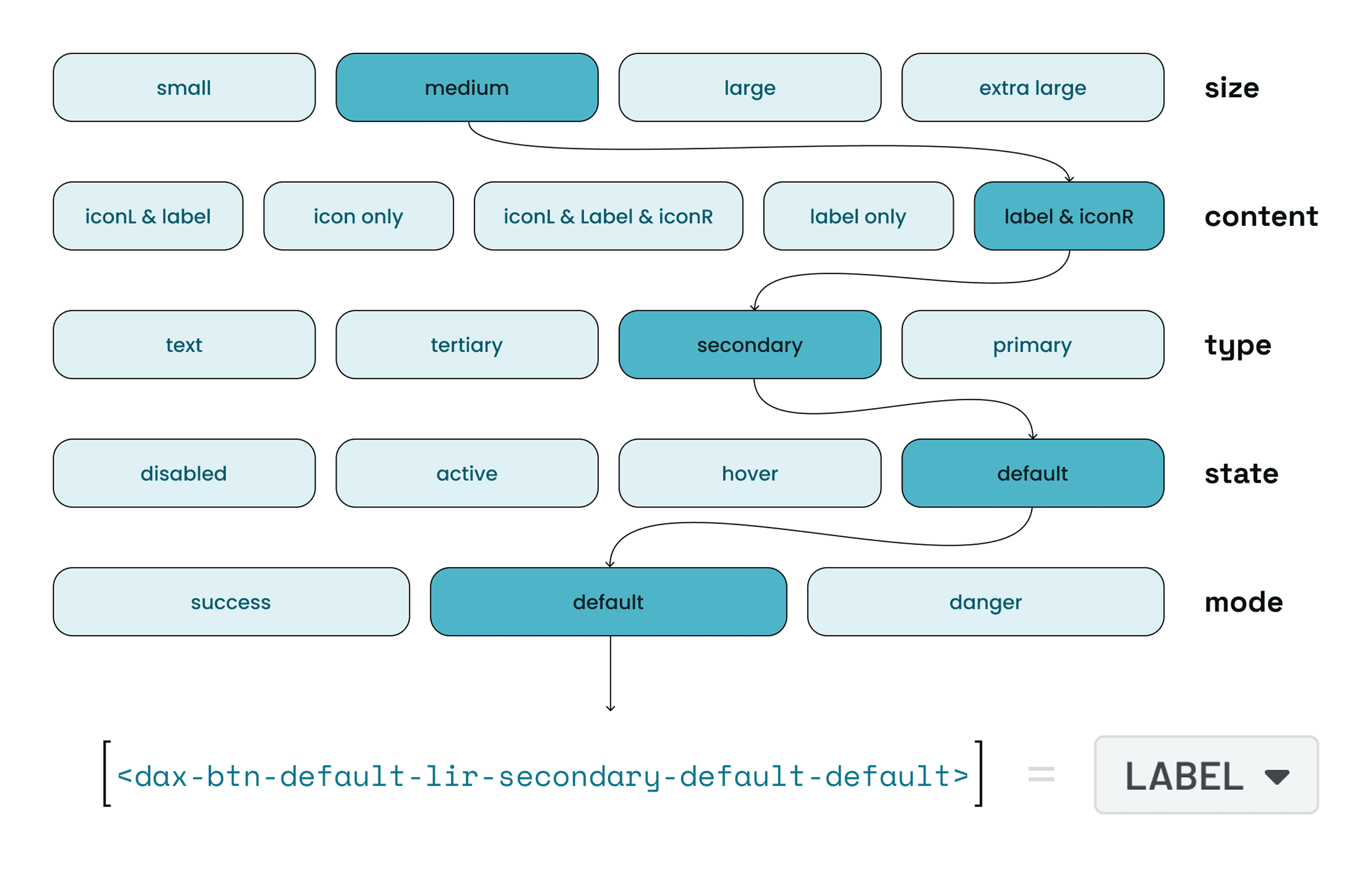
Fragmented property groups. The component's API was split across five collapsible sections (.dax-btn-states, .dax-btn-Margins, .dax-btn BASE, dax-tooltip-directions, .dax-tooltip) plus a top-level toggle. Designers had to navigate multiple disconnected panels just to configure a single button, with no clear logic to how properties were grouped.
No guardrails against invalid states. Size was controlled by five individual boolean toggles (XS through XL) rather than a single selector. Nothing prevented a designer from enabling multiple sizes at once, and across the full API, the majority of possible combinations produced broken or meaningless output.
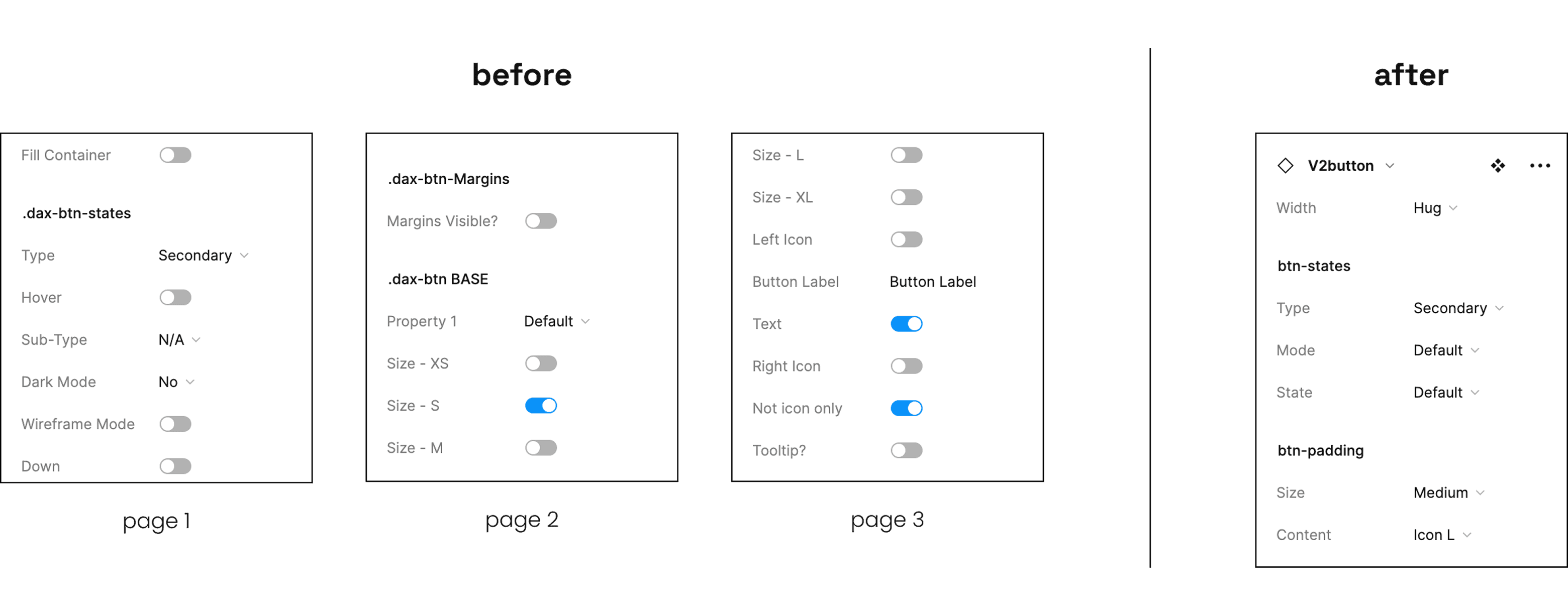
Inconsistent naming. Property labels ranged from completely generic (Property 1) to double negatives (Not icon only) to inconsistent punctuation (Margins Visible?, Tooltip?). Section naming alternated between dot-prefix (.dax-btn-states) and no prefix (dax-tooltip-directions). There was no shared convention for designers to learn and rely on.
Coupled concerns. Tooltip configuration, including direction and content, was embedded directly inside the button component. This meant any tooltip update required modifying the button itself, tightly coupling two components that should be independent.
These issues weren't cosmetic. They were the direct cause of the instability and cognitive overhead the survey had surfaced, and they repeated across multiple components in the library.
Solution
Architecture Principles
Orthogonal properties. Size, content, type, state, and mode operate as independent single selectors with mutually exclusive options. Every combination is valid by design, eliminating invalid states at the structural level rather than relying on documentation to prevent them.
Separation of concerns. Visual styling (btn-states) and spatial/content configuration (btn-padding) are managed in distinct groups. Unrelated components like tooltips are fully decoupled and composed independently.
Semantic naming. Every property uses plain, descriptive labels that describe function rather than implementation. The naming convention is consistent across the entire API, making components learnable on first use.
The Redesign
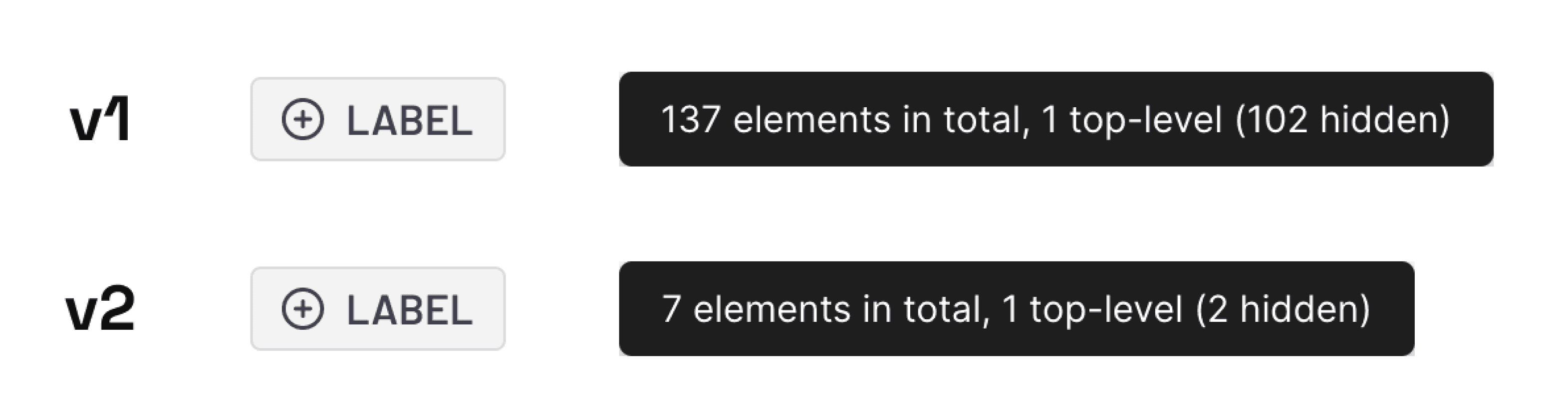
The V1 button required designers to navigate 20+ properties across five disconnected sections. The V2 API reduced that to 5 properties across 2 sections.
Two functional groups. btn-states handles visual styling through Type, Mode, and State. btn-padding handles spatial and content configuration through Size and Content. The grouping is predictable, and designers can find what they need without scanning the entire panel.
Every property is a single dropdown. Size toggles, boolean switches, and generic labels are gone. Each property offers mutually exclusive options, meaning every possible combination produces a valid output. Invalid states are eliminated by design, not by documentation.
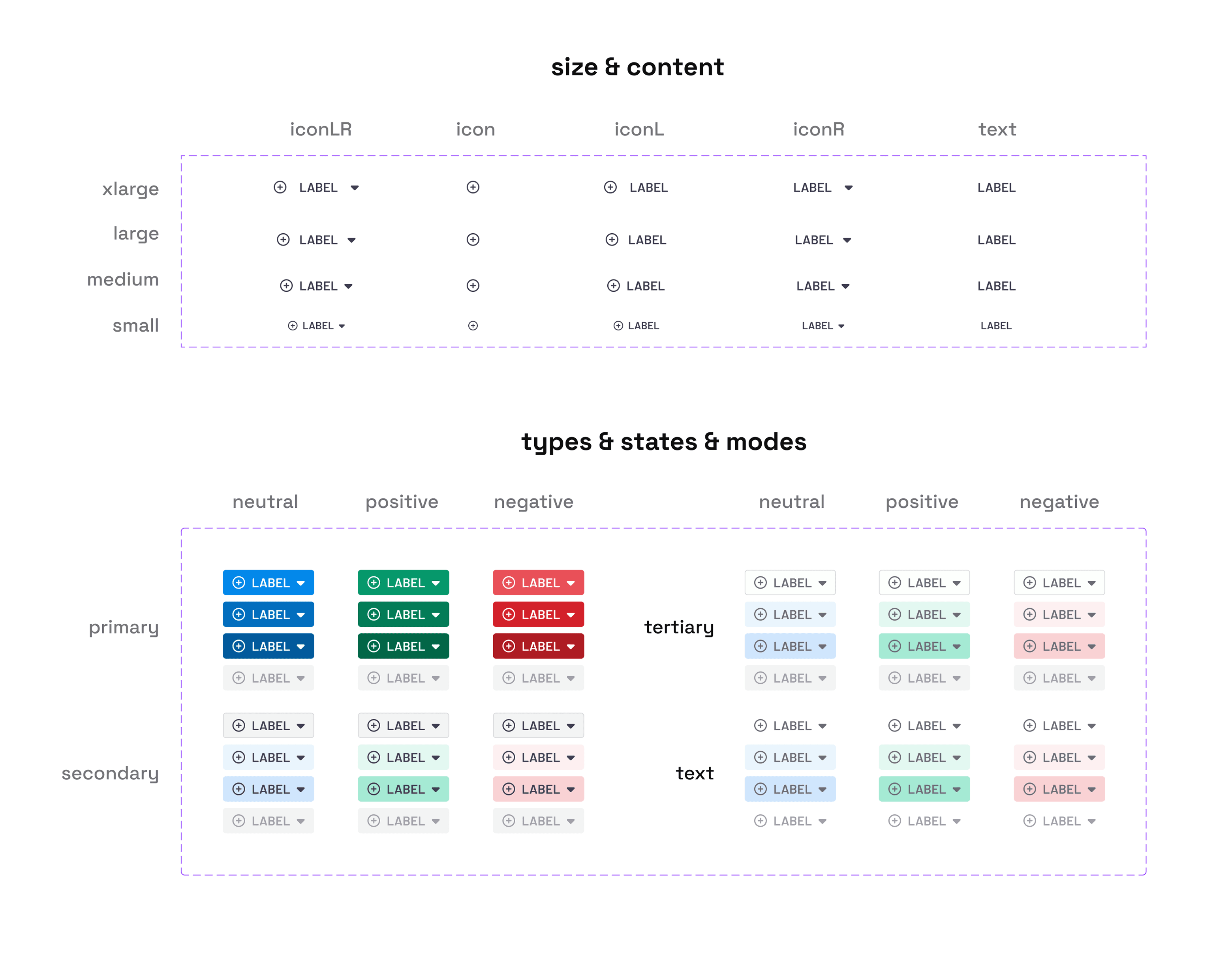
Consistent, semantic naming. Every label is a plain, descriptive word. No Property 1, no double negatives like Not icon only, no inconsistent punctuation. The naming convention is learnable in seconds.
Decoupled concerns. Tooltip configuration has been removed from the button entirely. The button handles button concerns. Tooltips can now be updated, versioned, and composed independently without touching the button component.
Eliminated redundant layers. The V1 button relied on deeply nested variants with dozens of hidden layers to power its structure. The V2 button strips that away entirely, with only a few hidden layers. This reduction in underlying Figma complexity is what drove the performance gains across files.
The result is a component API that a designer can understand on first use and trust on every use after that.
Documentation
The research audit had surfaced zero component-level documentation as a major gap. Improving the architecture alone wouldn't solve adoption if designers still had to rely on tribal knowledge to use the system. I created documentation across three areas.
Component usage guidelines. Each refactored component received documentation covering when to use it, when not to use it, and how it fits within the broader system. This gave designers a clear decision framework instead of guessing which component was appropriate for a given context.
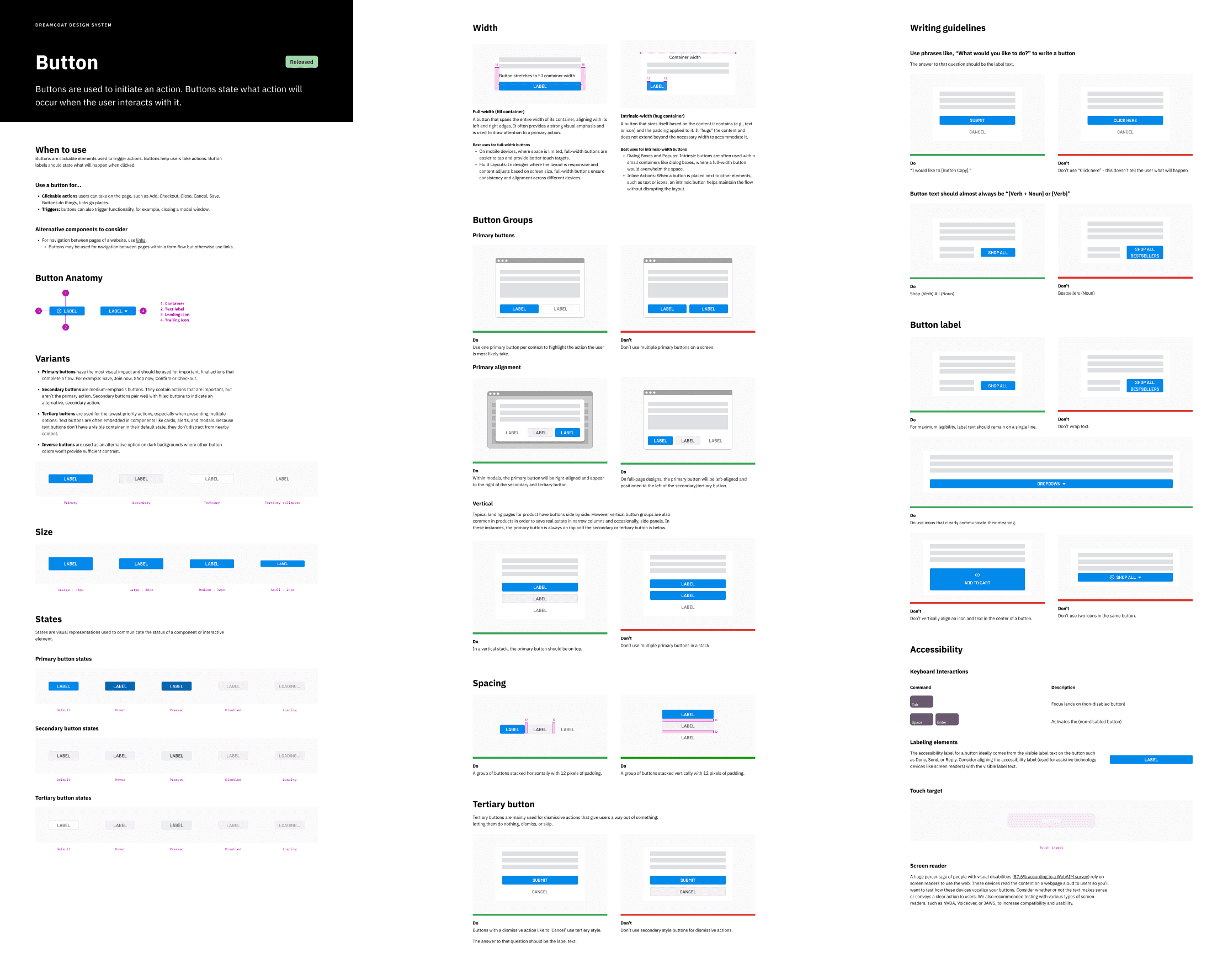
Property documentation. Every property in the new API was documented with its purpose, available options, and expected behavior. This directly addressed the confusion caused by the old architecture, where labels like Property 1 and Not icon only left designers guessing.
Pattern guidance. Documentation for how to combine components in common use cases, filling the gap that scored negative in the original audit. Designers could reference established patterns rather than improvising compositions and risking inconsistency across products.
Education & Adoption
Alongside the documentation effort, I focused on socializing the design system across the organization. I held regular office hours for product designers and developers to walk through the redesigned components, answer questions, and gather feedback.
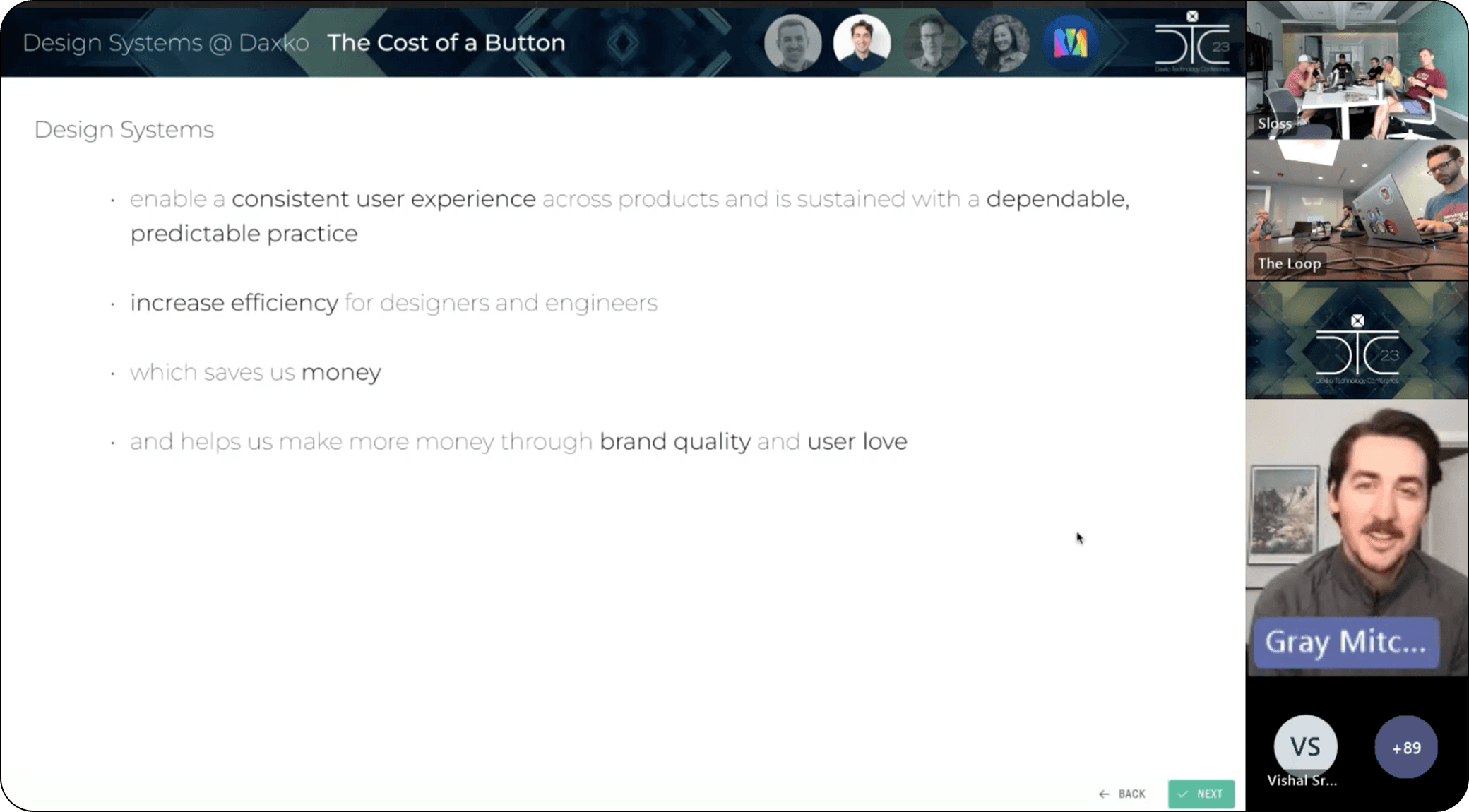
I also developed and delivered a company-wide keynote, "The Cost of a Button," connecting component architecture decisions to business outcomes: efficiency, cost, brand quality, and revenue. These efforts built shared understanding across teams and prepared everyone for the transition to V2.
Implementation
The button refactor proved the methodology. After its success, five additional components went through the same process: audit, redesign, and documentation.
With the redesigned components validated in Figma and documentation in place, we transitioned from design to development. I partnered with engineering to build the coded component library using standard agile methodology.
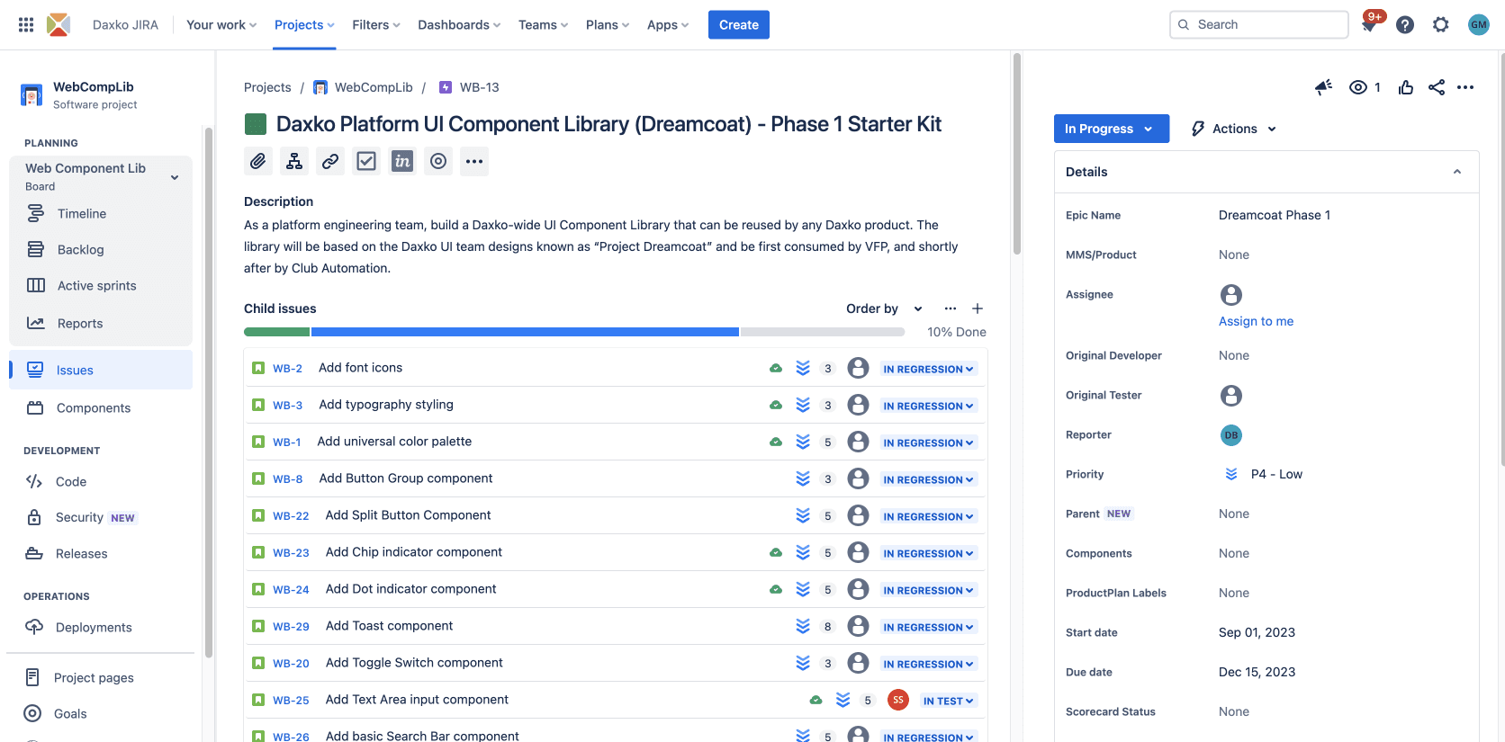
Work was scoped into sprints, tracked through Jira, and organized under the Dreamcoat Phase 1 epic. Each component followed the same cycle: ticket creation, development, regression testing, and release. This gave the team a predictable cadence for delivery and a clear view of progress across the full library.
Results
77% faster render performance
98% reduction in hidden layers
The redesign cut 95% of component complexity while expanding flexibility. The patterns established here became the repeatable framework for every component that followed.
More Work