Company
Estee Lauder Companies
Year
2024
Roles
Color Theory, Accesibility
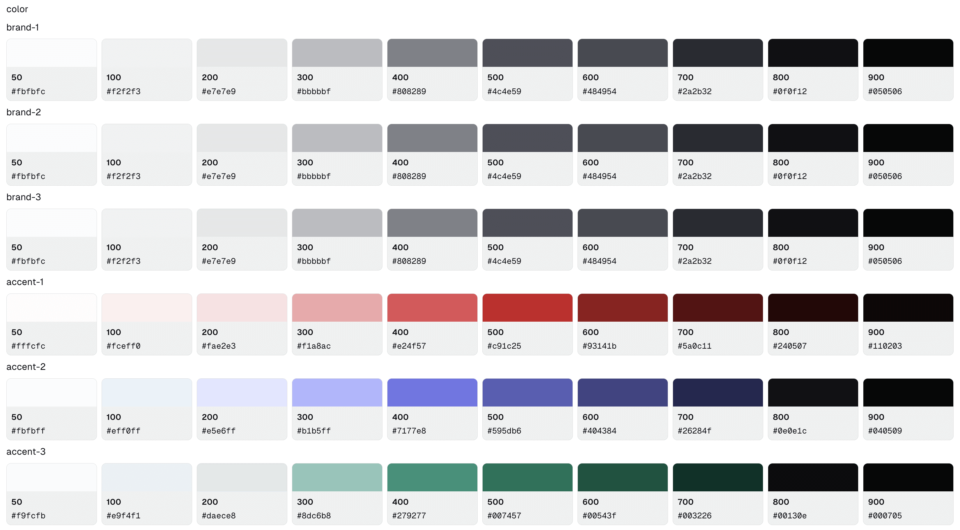
Programmatic Color Primitives
Traditional color tools produce inconsistent contrast ratios across hues, making it impossible to guarantee accessibility while accommodating brand requirements. Developed a node-based generation system that maintains WCAG compliance through perceptual color science and semantic role targeting, enabling multi-theme color systems with predictable, accessible primitives.

Challenge
Design teams need color systems that guarantee accessibility, accommodate brand constraints, and scale across multiple themes, but traditional color tools treat these as competing priorities rather than integrated requirements.
Approach
Developed a programmatic color generation system that combines perceptual color science with Material Design's semantic role architecture, implemented through Token Studio's node-based graph editor for flexible, production-ready output.
Impact
Perceptually uniform color scales across all hues
WCAG AA/AAA compliance guaranteed programmatically
Brand color integration without accessibility compromise
Direct JSON token output for engineering handoff
Iterative refinement through visual node logic
Understanding Color Perception
From Newton to Digital Design
In 1666, Newton's prism experiments revealed that white light contains a spectrum of colors, each associated with specific wavelengths. This discovery transformed color from mystical subject to scientific phenomenon, establishing that color has a natural, physical order. Newton bent his spectrum into a circle, creating the first color wheel, a pattern that would evolve through centuries of attempts to organize color logically.
For hundreds of years, color remained studied purely as physics. It wasn't until 1963 that Josef Albers explored color's subjective nature in "Interaction of Color," demonstrating that human perception of color is relative and context-dependent:
"In visual perception a color is almost never seen as it really is—as it physically is. This fact makes color the most relative medium in art."
This tension between objective measurement and subjective experience creates the fundamental challenge of digital color systems: how do we design with a medium that continuously deceives?

The RGB Problem
Digital screens create color through additive light, each pixel combines red, green, and blue subpixels at varying intensities. The RGB color space emerged to represent these combinations, using values from 0-255 for each channel.
HSL (Hue, Saturation, Lightness) emerged as a more designer-friendly interface to RGB, separating color identity from its intensity and brightness. Tools like Figma default to HSL color pickers, allowing quick manipulation through familiar concepts.
The critical flaw: HSL's lightness channel doesn't correspond to perceived brightness. A blue, green, and red—all at L:50—appear dramatically different in brightness to human vision.
Trichromatic Theory
Human color vision operates through three types of cone cells in the retina, each sensitive to different wavelengths: short (blue), medium (green), and long (red). These cones don't respond equally, we're most sensitive to green light, moderately sensitive to red, and least sensitive to blue.
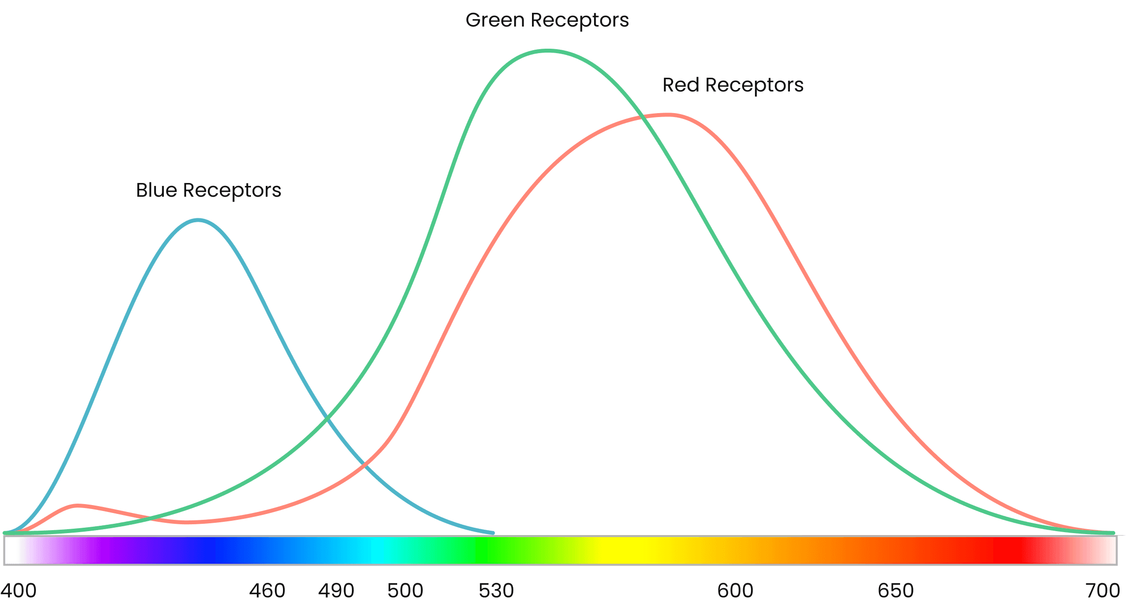
Practical consequence:
When you create semantic color scales (success green, destructive red, informational blue) at consistent lightness values, they produce wildly different contrast ratios:
Blue-500 at L:50 → 4.8:1 contrast on white (WCAG AA compliant)
Green-500 at L:50 → 2.9:1 contrast on white (fails minimum standards)
Red-500 at L:50 → 3.7:1 contrast on white (marginal)
Status indicators, semantic buttons, and alert components suddenly have inconsistent accessibility profiles despite appearing systematically designed.
Semantic Color Roles
The Role Hierarchy
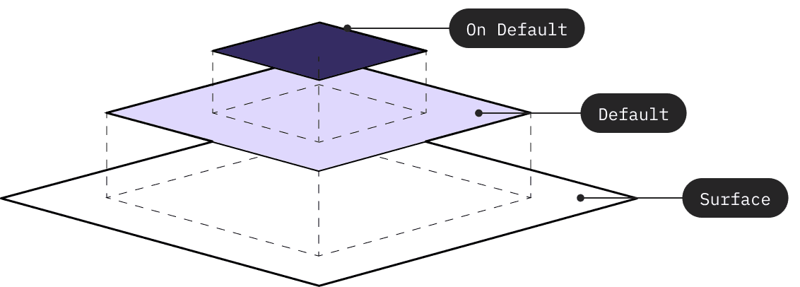
Material Design introduced a color role system where colors have defined purposes and guaranteed contrast relationships. At its core, the system separates colors into two categories:
Background Roles (surfaces, containers)
These form the base layer, the surfaces on which content lives. They define the bottom end of contrast ratio calculations.
Foreground Roles (text, icons, UI elements)
These sit on top of backgrounds and must meet minimum contrast targets against their corresponding surface. Each foreground role has a defined contrast ratio target for legibility.
The genius of this approach: by structuring color generation around these contrast relationships, accessibility becomes architectural rather than aspirational.
Dynamic Ramp Generation Logic
Traditional color tools generate fixed ramps, you get 100 through 900 regardless of your needs. But different design systems need different structures: some require many surface elevation variants, others need extensive foreground options, some need both.
The graph logic I developed makes this structure user-configurable:
1. Surface/Container Generation
Users define:
Number of surface steps needed (e.g., 3 surfaces, 2 containers)
Starting brightness value (typically near white for light mode)
Delta between steps (e.g., 5% brightness reduction per step)
This generates the background layer dynamically, a base surface, elevated surfaces at incremental brightness changes, and container variants for lower-emphasis UI elements.
2. Foreground Role Targeting
With background roles established, foreground colors can be calculated using contrast ratio targets. For each foreground role, I define:
Which background role(s) it must appear on
Target contrast ratio (typically 4.5:1 for WCAG AA compliance)
Source color to dictate the hue
Leonardo's color engine maintains these contrast targets while preserving the intended hue, ensuring that on-surface text achieves 4.5:1 on all surface variants, primary maintains contrast on its container, and so on.
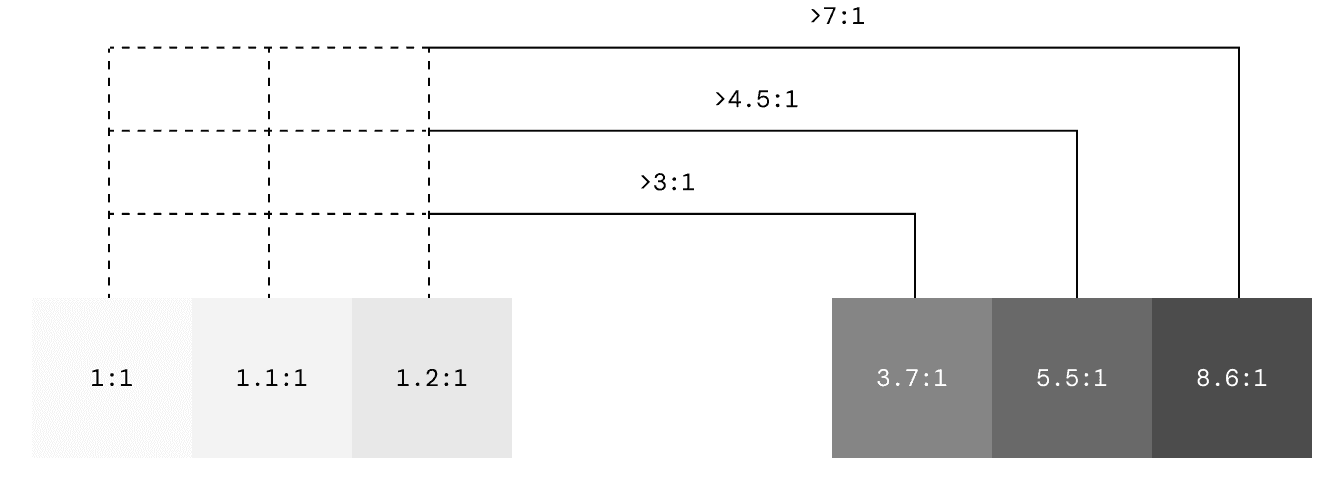
3. Beyond Minimum Contrast
Once the minimum 4.5:1 threshold is met, additional darker steps are generated in equal increments. This creates predictable behavior for designers: if a role needs to appear on another colored role (not just neutral surfaces), they can confidently select progressively darker steps knowing each will maintain sufficient contrast.
Programmatic Implementation
With the theoretical foundation and structural requirements established, the challenge becomes implementation: how do you build a system flexible enough to accommodate real-world constraints while maintaining the perceptual and accessibility principles?
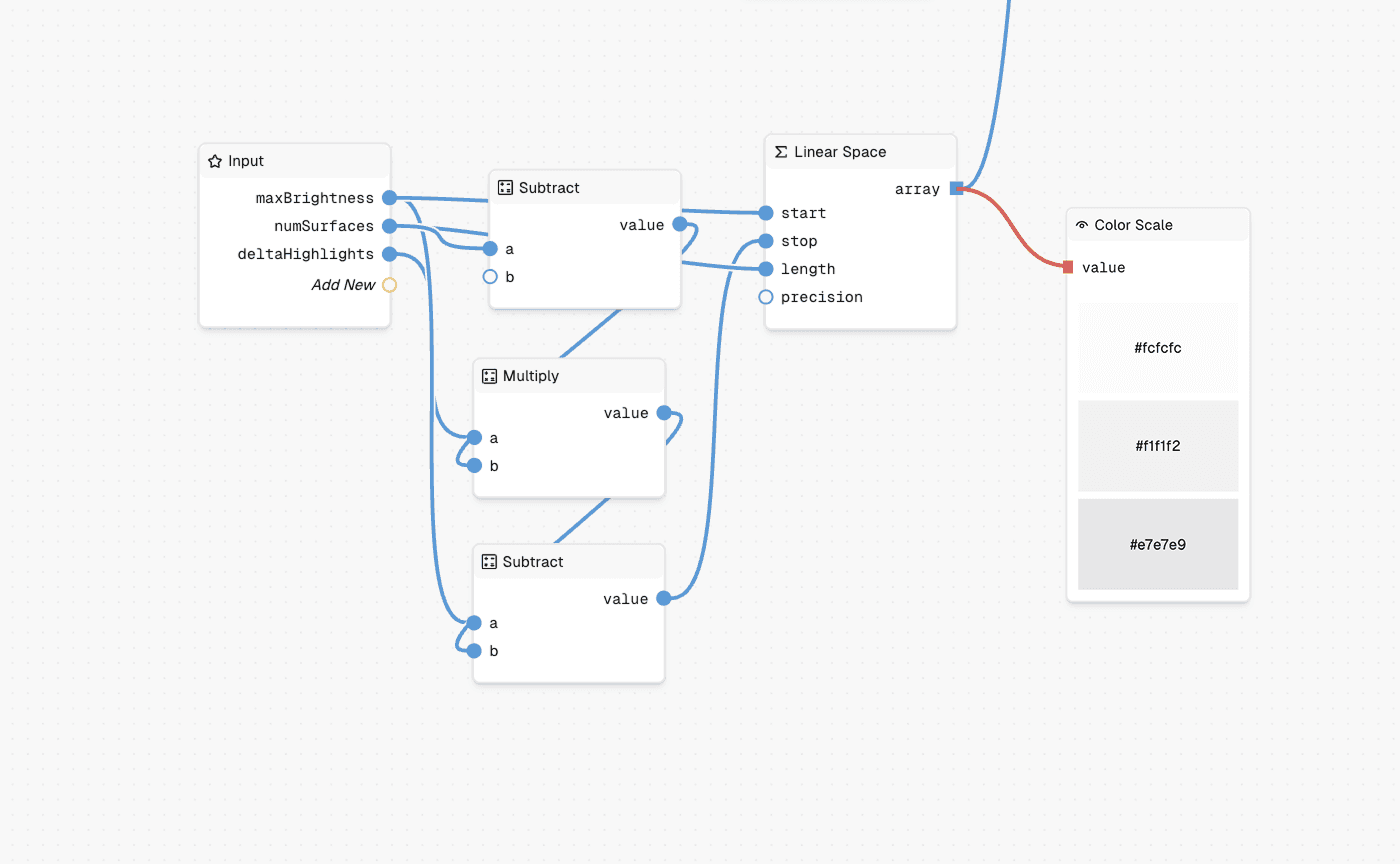
Node-Based Color Generation
Token Studio's graph editor provides a visual programming environment for color generation. Rather than static parameters that produce fixed outputs, the graph treats color generation as a logic flow where each step can be observed, adjusted, and validated.
The graph connects input nodes (source colors, contrast targets, surface configuration) through calculation nodes (LAB lightness extraction, Leonardo engine integration, perceptual curve interpolation) to transformation nodes (color space conversion, formatting, validation) and finally to output nodes that generate structured JSON tokens ready for engineering integration.
Flexible Custom Logic
The node-based approach shines when accommodating business constraints that don't align with theoretical ideals. A common challenge: brand teams specify exact hex values that must appear in the final primitive ramps, but these colors weren't designed with perceptual uniformity or contrast targets in mind.
In one implementation, the requirement was to preserve specific brand hex colors while maintaining the accessibility guarantees of the underlying system. I built a custom processor node that:
Generates the theoretical color ramp using Leonardo's contrast targeting
Takes the brand hex color as input
Calculates which primitive step best matches the brand color's perceptual lightness
Inserts the exact brand hex at that position
Recalculates adjacent steps to maintain the contrast curve

The result: brand colors appear exactly as specified in the output primitives, while the rest of the ramp adjusts to preserve contrast relationships. As the source brand color changes, the system dynamically repositions it and recalculates the surrounding steps in real-time, maintaining both brand fidelity and accessibility compliance.
This type of conditional logic would be impractical in traditional color tools, but becomes straightforward in a visual programming environment where the decision tree is explicit and modifiable.
Outcomes
For Design Teams:
Color systems that accommodate brand requirements without sacrificing accessibility
Fast iteration through visual node editing rather than parameter guessing
Confidence that semantic colors maintain consistent contrast across hues
Dark mode support built into generation logic, not retrofitted
For Engineering Teams:
JSON token output maps directly to design token systems (Style Dictionary, etc.)
Semantic structure enables runtime theme switching
Reduced back-and-forth on color specifications and accessibility fixes
Primitive, semantic, and component layers align with code architecture
For Product Ecosystems:
Multiple brands supported from single source of truth
Consistent semantic relationships across all themes
Accessibility compliance guaranteed through generation logic, not manual checking
Color systems that scale as product complexity grows
Conclusion
Building accessible color systems requires bridging three domains: the perceptual science that governs how humans see color, the semantic structure that defines how colors relate through contrast relationships, and the programmatic flexibility to accommodate real-world constraints. By grounding primitive generation in CIELAB color space, structuring tokens around Material Design's role architecture, and implementing through node-based logic, this system transforms accessibility from an aspiration into an architectural guarantee. The result isn't just a color palette, it's a scalable, maintainable foundation that adapts to business requirements while ensuring every color pairing meets its contrast targets across all themes and contexts.
More Work