Company
Estee Lauder Companies
Year
2025
Roles
Token Architecture, Brand Design
Multi Dimensional Theming
Extending a multi-brand design system with compositional typography tokens to give 20+ Estée Lauder brands typographic flexibility without sacrificing architectural consistency.

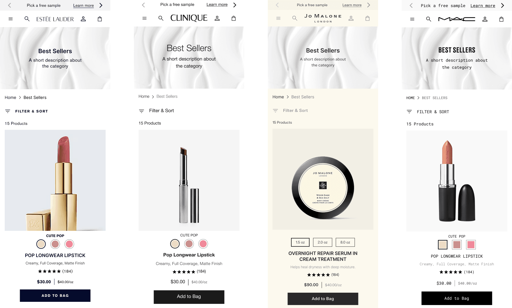
Estée Lauder Companies owns over 20 premium beauty brands, each with distinct visual identities. To streamline UX quality and accelerate implementation across brand.com sites, the company initiated a design system project to replace the fully custom style guides each brand had maintained.
The initial approach was a two-layer token architecture: primitives (hidden from designers) and global semantic tokens (exposed to designers). It worked well for properties like color, which had predictable accessibility-driven logic. But typography was different. Brands needed compositional flexibility, not just value swapping.
As the sole designer working in Figma and Tokens Studio, I identified the core limitation and developed a 2.5-layer architecture that added an intermediate layer for typography composition. This gave brands the customization they expected while maintaining the constraints of the original semantic token system.
The Two-Layer System
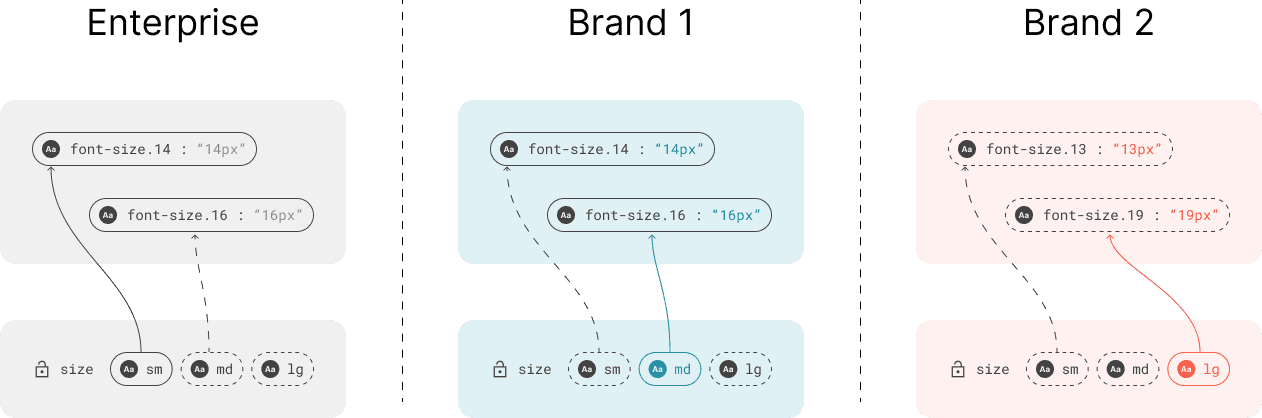
When I joined the design system team, a two-layer token architecture was in place: primitives contained raw values, and semantic tokens mapped those values to design intent.
The Architecture
Primitives (Layer 1): Raw values named literally for what they contained (like font.font-size.16: "16px" or font.font-transform.uppercase: "uppercase").
Semantics (Layer 2): Global, abstract tokens that aliased primitives using {curly brace} syntax. Named for design intent rather than literal values (like font.size.md pointing to {font.font-size.14}). These were globally scoped, meaning the same semantic tokens were used throughout the entire site.
The semantic layer had two collections: theme (light/dark modes) and responsive (xs/sm/md/lg viewport modes).
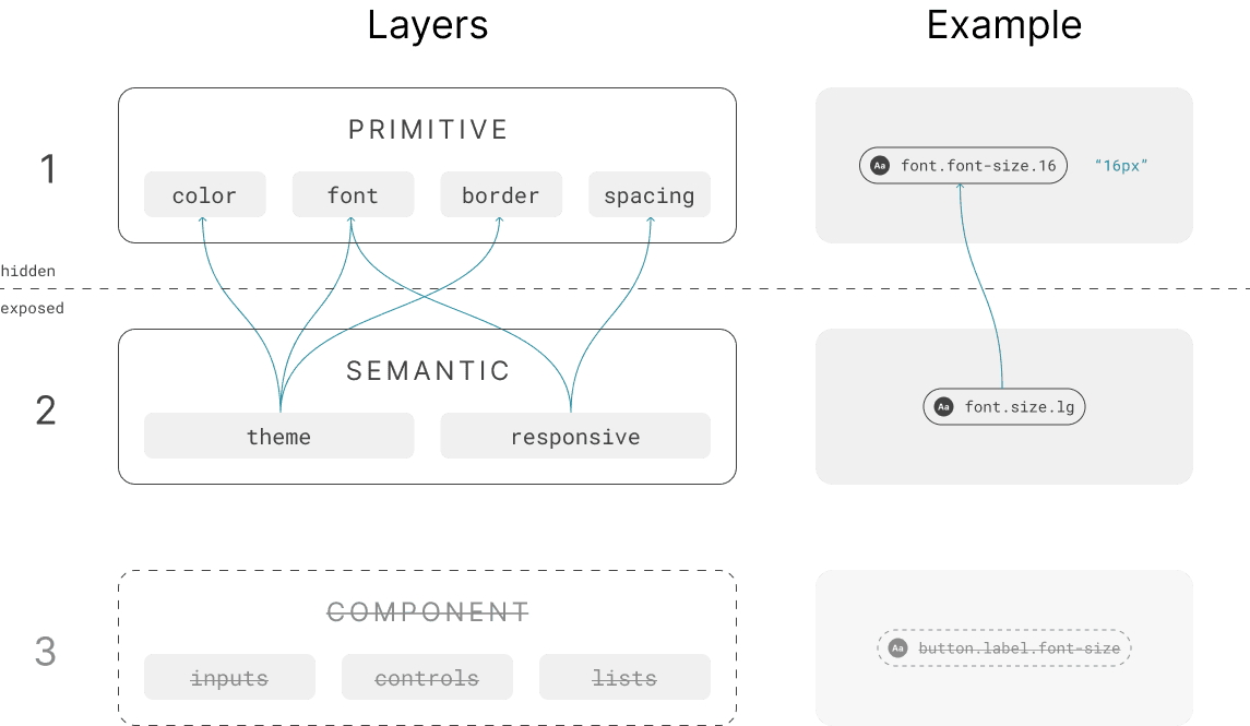
Why not a third layer? A full three-layer system with component-scoped tokens for all properties (color, spacing, borders, etc.) had been considered but avoided. It would have created massive token bloat. Every component would need its own set of tokens for every property type, making the system unmaintainable and inefficient. The two-layer approach worked well for most token types, which only needed value swapping.
How Brand Theming Worked
Each brand got their own token set, initially copied from enterprise. The schema was locked, but brands could customize:
Primitive values (one brand's
font.font-size.16could be14px, another's18px)Semantic mappings (
font.size.mdcould point to different primitives per brand)
Components consumed semantic tokens. A button might use {font.size.md} + {font.transform.uppercase}. Once applied in the component definition, tokens were locked. Instances couldn't reassign them.
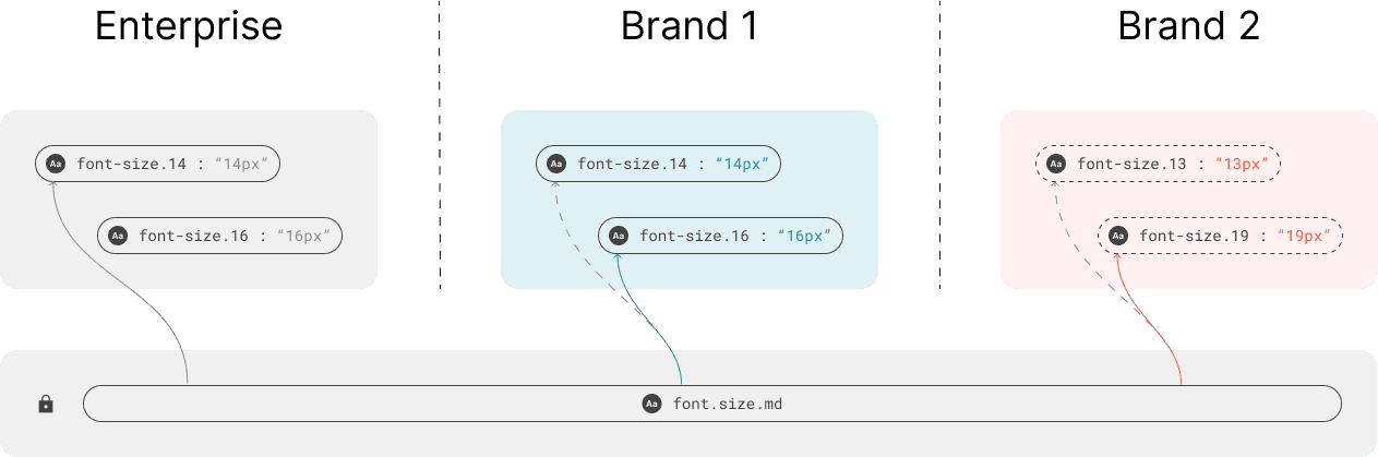
The contract: The semantic token schema stayed stable. Brands controlled what those tokens resolved to, but couldn't add or remove tokens.
Where It Worked: Color
Color had universal application logic rooted in accessibility:
{color.surface.on-surface}for primary text on surfaces{color.critical.critical-default}for errors{color.primary.primary-default}for primary interactive elements
Brands could swap values (red vs. blue), but the logic stayed constant. Perfect for the two-layer system.
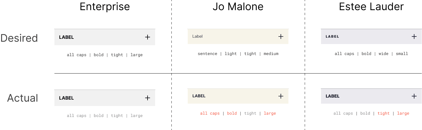
Where It Broke Down: Typography
Typography required composition: multiple tokens combined together. An accordion label might need {font.size.lg} + {font.transform.uppercase} + {font.weight.medium} + {font.letter-spacing.default}.
Different brands expected different compositions:
Brand A: uppercase + loose letter spacing
Brand B: lowercase + tight spacing
Brand C: larger size + heavier weight
The two-layer system could swap individual token values, but couldn't swap which tokens were in the composition. That logic was hardcoded in component definitions. The desired typography treatment varied by brand, but the actual output was identical. All brands were forced into the same composition.
Three problems emerged:
Manual variants: To support uppercase vs. lowercase accordions, we created component variants. Designers manually swapped every instance. Not automated, not scalable.
Token cramming: If a brand wanted smaller defaults, we had to remap
{font.size.lg}to a smaller primitive value than intended. When multiple brands needed contradictory outputs, primitive ramps became incoherent.Unpredictable letter-spacing: While implementing letter-spacing tokens, I discovered brands had wildly different application patterns. Some wanted tight spacing on uppercase text, others wanted loose spacing on buttons but tight on labels. There was no universal logic, but the system forced universal application. Outputs were unpredictable.
The Core Problem
Single-value tokens (color, spacing) could be swapped through value changes alone. Composite tokens (typography) needed compositional flexibility: the ability to change which tokens were combined, not just their values.
Components were acting as the composition wrapper. To automate brand theming for typography, composition logic needed to move into the token layer itself. Brands needed to define how to compose tokens through JSON, just like they swapped values.
This became the foundation for the 2.5-layer architecture.
The Solution
The 2.5-Layer Architecture
The solution was to add an intermediate layer between semantic tokens and components, specifically for typography composition.
I called it "2.5 layers" because it was a surgical solution. Color, spacing, and borders still used global semantic tokens. This layer existed solely to solve the composition problem for typography. Other token types worked fine with value swapping alone.
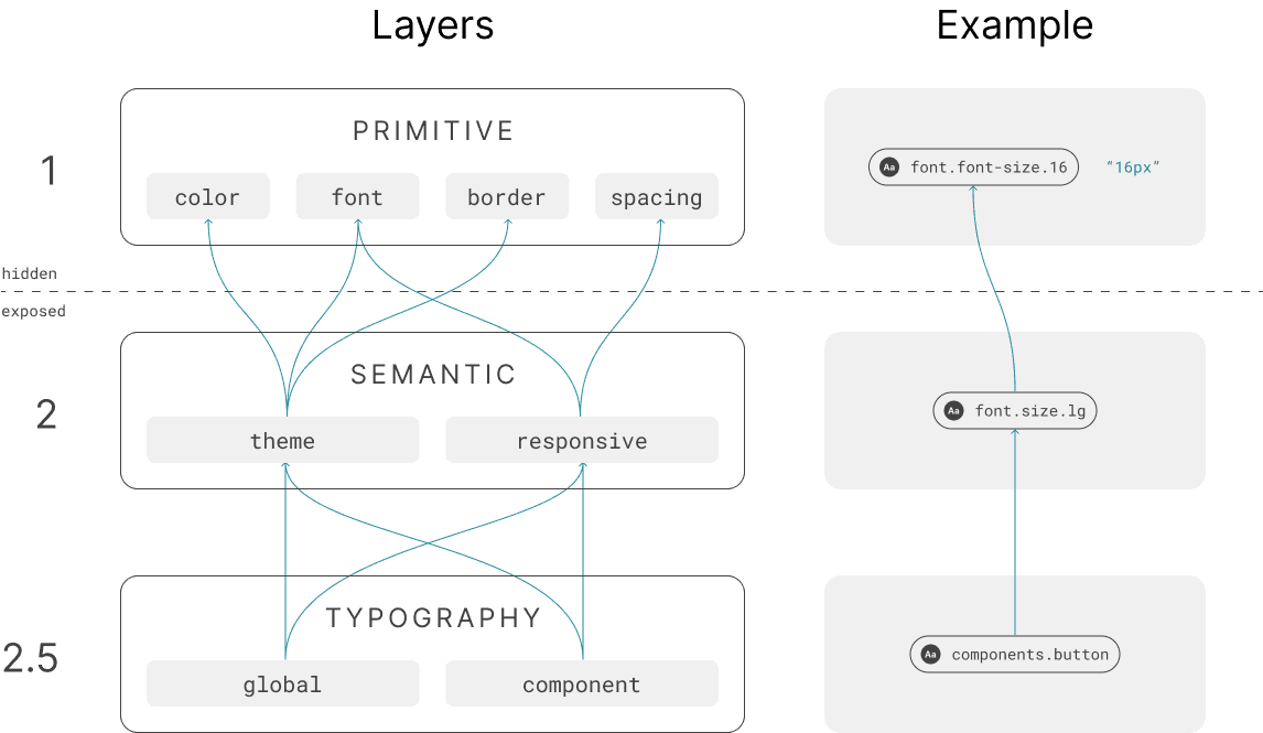
The new layer introduced composite typography tokens: stable wrappers that defined which semantic tokens to compose together.
Two Collections, Different Scopes
Global Collection
General typographic styles used throughout the site (headings, body text, legal text, subtitles). These provided functional hierarchy with granular options like heading.lg, body.sm.default, and body.sm.medium. Used in general components that needed to match each other across the site.
Components Collection
Typography for specific components or component groups (accordion, button, controls, inputs, lists). More opinionated and scoped to particular UI contexts. The grouping approach meant components with similar typographic needs shared tokens based on their API shape. All form controls used the same label/description/price tokens.
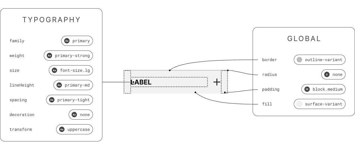
Composite typography tokens handled all typography properties (family, weight, size, line height, text case, decoration, letter spacing), while other component properties like border, padding, and fill continued using global semantic tokens. This kept the solution surgical. Only typography composition needed the intermediate layer.
How Composition Worked
Each composite token contained slots for all typography properties, referencing semantic tokens:
Brands could now customize at three levels:
Composition (which semantic tokens filled each slot)
Semantic mappings (which primitives those semantic tokens pointed to)
Primitive values (what those primitives resolved to)
The Stable Schema
Like the semantic layer, the composite typography schema was locked. Every brand got the same set of composite tokens. They couldn't add or remove them. This maintained the component contract while allowing flexibility within the schema.
Composite tokens could reference either static tokens (from theme collection) or responsive tokens (from responsive collection). Global headings typically used responsive tokens to scale across viewports, while component tokens stayed static for consistency.
What This Unlocked
No more manual variants: Brands remapped
textCasein JSON instead of creating component variantsNo more token cramming: Brands composed different semantic tokens instead of distorting primitive scales
Predictable letter-spacing: Each brand defined application patterns through compositions
Automated theming: Typography worked like color. Swap JSON configs, system updates automatically
Composition logic was now managed as configuration, not hardcoded into components.
Figma Implementation
Implementing the 2.5 Layer: Text Styles
The composite typography tokens required a new implementation approach. When exploring how to bring these into Figma, I discovered that Tokens Studio exports composite typography tokens as text styles, not variables.
This turned out to be exactly what we needed.
Text styles are somewhat old-fashioned in Figma's modern variable-based workflow, but they have a unique capability: Figma allows you to swap all text styles in a file from one library to another, as long as the style names are identical. This is a native Figma feature for migrating between design systems.
How it worked: Each brand got their own text styles library containing the same set of composite typography tokens (enforced by the stable schema requirement). The style names were identical across all brand libraries: components.accordion, global.heading.lg, components.controls.label.default, etc.
Because the names matched, designers could use Figma's native "swap library" feature to instantly replace all text style definitions in a file.
The Two-Step Theming Workflow
To theme a file for a specific brand, designers performed two actions:
Change the brand mode on each page (swaps variable values for color, spacing, borders, etc.)
Swap the text styles library from Enterprise to the target brand (swaps all typography compositions at once)
This dual approach leveraged two different Figma mechanisms:
Variables handled single-value tokens through mode swapping
Text styles handled composite typography tokens through library swapping
Both updates happened instantly. A designer could theme an entire multi-page file for a new brand in seconds.

The crucial advantage: Since both variables and text styles were synced to GitHub as JSON, the developer handoff was completely automatic. Unlike component libraries which require manual publishing and version management in Figma, token changes flowed directly through the pipeline. Developers always had access to the latest token definitions without any manual intervention from the design team.
Outcomes & Impact
Automated Typography Theming
The 2.5-layer architecture transformed typography theming from manual to automated, bringing it to parity with color theming.
Before: Typography compositions were hardcoded in components. To match brand visual treatments, designers manually swapped variants across entire mockups (assuming the variant existed). We created multiple typography variants to cover brand needs, bloating the component library.
After: Typography became configuration-driven. Designers themed entire files in seconds (mode swap + library swap). Brands achieved exact typographic identity without touching components.
Key Improvements
For designers: Theming went from hours of manual variant swapping to seconds of mode changes.
For developers: Composite tokens consumed directly from JSON. No more inspecting component instances for typography overrides.
For the system: Eliminated typography-specific component variants. Components stayed lean; typographic variations lived in token configuration.
For brands: Precise control over text case, letter spacing, font weights, and how these combined across the component library. The system finally supported the level of customization brands expected.
The 2.5-layer architecture proved that systematic constraints and brand flexibility weren't mutually exclusive. By finding the right abstraction (composition as configuration), we achieved both.
More Work